Our service to report a missed bin collection is one of the most used on our website. The landing page had over 32,000 visits in 2022, putting it in the top 0.4% of our website pages. Yet there’s also a significant volume of calls to our citizen service centre for related issues.
We plan to improve the form through an internally developed rebuild. This is in response to feedback, complaints and because the current form developed by a third party is difficult to maintain or refine.
We want to achieve a better user experience that will allow more users to resolve issues with their recycling and waste collections efficiently with minimal added frustration. We expect this to help reduce complaints, negative form feedback and call volumes.
We completed a discovery phase to understand user needs and pain points, validate assumptions and inform design ideation.
We did user research between October and December 2022 to help define the problems and ideas for a minimum viable product and backlog for potential future iterations.
As-is user flow
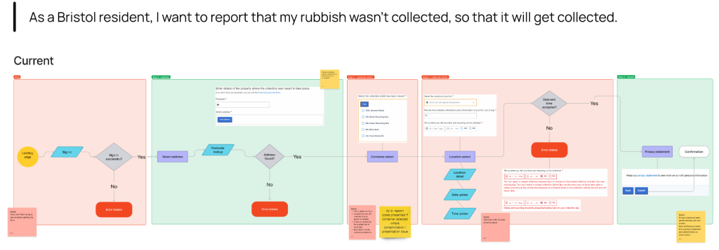
We started by mapping the current flow. The user has to sign in, select their address, select a container that was missed, and then fill in a screen with questions about the location of the bins and the date and time they were put out, before reading the privacy statement and submitting.
Assumptions
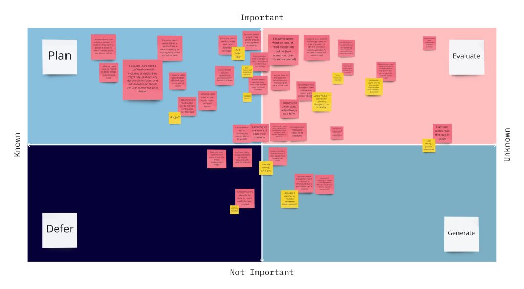
We did an assumption slam to record what we thought the pain points and user needs are. We mapped them into a matrix of importance against level of evidence to prove if the problem is known or needs more research. We would focus our research on validating the important, unknown assumptions and testing ideas for important, well-established points.
Research
Our research included:
- expertise from UX and content design colleagues and a competitive analysis
- data analysis
- a survey
- detailed interviews with users
This identified and validated the most significant pain points and suggested where there might be unmet user needs.
Data analysis
We looked at data from:
- 1,278 website feedback forms
- a sample of 20 complaints
- 718 calls to our Citizen Services contact Centre (CSC)
- 1,808 abandoned forms in the back-office system
The most common problems from all sources were:
- only one container allowed per report
- difficulty or frustration with signing in
- inputting the date and time they put their bins out
- using the postcode tool to find their address
- error messages, which are usually when the form is blocked outside the reporting window
The complaints also said there’s no way to flag repeated missed collections or reports not resolved, and confusion or frustration with the form being blocked at 5pm the day after their collection.
Half of the calls to our CSC resulted in advisors raising an ad-hoc report using an unrelated ticket. This was because there wasn’t a digital pathway to meet the user need for:
- non-standard missed collections such as bulky waste, garden waste sacks, or sharps bins
- escalating reports not resolved
- repeated missed collections
Survey
We sent a survey to 324 users who had made a missed collection report in the past two weeks and had 96 responses.
Of those who called us, most had tried a form first. They were willing to use the form again but had problems it could not resolve.
Users said easiness and time were the main reasons for using digital, so we know we need to prioritise designing a quick and simple journey. 66% of respondents had multiple missed collections, and a quarter said they had no outcome from submitting a report online. They complained about having to call to check the status of their report or escalate it, resulting in the opposite experience.
We asked users how we could best improve the form. We gave them a free text field and codified responses into goal based themes to identify the user need. The most popular need, by far, was to report multiple containers. The current form has a radio button to report an individual container, but often all the recycling or waste and recycling is missed. Users don’t know whether to submit multiple reports for all of them, or just do one and hope we’ll collect the rest anyway.
Based on their feedback, users also needed to see:
- status information about their collections or a report they already submitted, so they know when to take a next step
- an option to flag repeated problems, so they don’t have to make a formal complaint
- a free text field to add more detail
When the digital channel doesn’t meet the user needs, they call us and wait in a que before advisors use an ad-hoc report to tell the waste service.
They were also frustrated by:
- our reporting window, as we block the form at 5pm the day after their collection due to a Service Level Agreement (SLA)
- a mandatory sign in before starting
Interviews
We did interviews in person and remotely with participants recruited by email after using our website feedback form. We spoke to seven users for 45 minutes each.
We organised questions into six themes based on the prior research. Using a presentation, we asked warmup questions and showed screenshots from the current form to discuss pain points, and wireframes of how new versions might look to demonstrate early ideas we wanted to test.
Reporting window: we showed the current error message if you try to make a report outside the SLA. We assumed it’s long and confusing, but most users told us it makes sense. They were less sure when we asked them to explain to us what it meant or what to do next.
Users were more frustrated with the SLA window itself. Most said they would wait later than 5pm the next day before thinking about making a report, as they may be at work or allow a grace period and assume this collection is delayed. By the time they feel confident they know it’s missed, we’ve closed the form.
Some were able to guess why we have this SLA when asked (because crews will have moved on to a different area and need to manage their workload) but they were uncertain. Some were a little more understanding when we explained why.
All of them were positive about wireframes for a flow that did not block the form outside the SLA, but instead allowed them to log a report with a statement that we won’t be able to come back this time. They all said they would still use the form. They expected we would use these reports to manage service levels and monitor repeated issues.
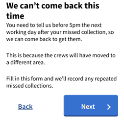
Collection dates: our competitive analysis found similar forms that display collection dates to simplify the user journey for the related tasks of checking dates and reporting a problem. We hypothesised this could be helpful as a reminder, or if the user had mistaken the collection date.
All the users we spoke to were positive about seeing collection dates in the form to report a missed collection, although some said it’s helpful but not essential for the task. However, they particularly wanted to see the next collection date here if the report will be blocked so they know what happens next, and not a link to our collection day finder.
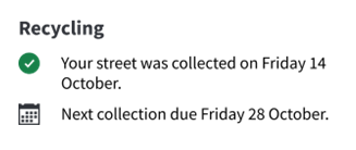
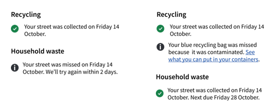
Status: status information was a popular concept, either for recent collections or a report already made. For collections, all users wanted to see if we already know we’ve missed it, for example because we’re behind schedule or someone has already reported the whole street. This would enable them to save time and not make a report, also reducing unnecessary reports made to the business.
It was also valuable to see if there were no recorded issues with your street. This allows the user to see we successfully collected their street so can continue with confidence that we missed their address.
Users were keen to point out that if we highlight an error they’ve made, such as bins not presented or contaminated, the language needs to feel like helpful advice and “not finger wagging.” They didn’t like the word ‘contaminated.’ They needed the message to tell them what to do next.
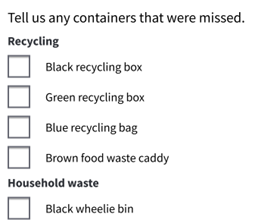
Multiple containers: all participants were very enthusiastic about a checkbox list to select multiple containers in one report, saying it was the quickest and simplest way to make the report.
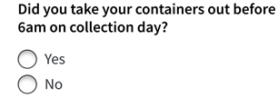
6am question: we currently ask for the specific date and time users put their bins out, which causes a lot of frustration. Users said they don’t always know and will have to guess or make up an answer.
We assumed users would be annoyed if instead we ask them if they did put their bins out before 6am, after we’ve already told them they must. They didn’t mind, but some admitted they may not be honest if they haven’t, and all said they didn’t believe other people would answer honestly. Having come this far, they’re incentivised to say yes to progress the form.
Some said 6am seems arbitrary and needed to see a personal collection time or GPS location of the collection truck, so that they could check if they still had time to put them out on the day if they’d forgotten. This could reduce missed collections but may not be feasible.
We should consider what value this question adds, particularly as crews are able to record bins not presented.
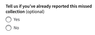
Escalations: we thought adding questions about escalations such as repeated missed collections, the whole street missed, or already submitted a report would get in the way. Most users did not mind and do need to tell us this – if it results in reducing future problems. It is currently unclear what service pathway would be the outcome if we included these. A user suggested we should already know without asking them ‘to do our job for us’.
Next steps
Read about what we’re doing next with this research.
Sign up if you want to take part in research to improve our digital services.