Following our discovery research we considered which areas for improvement had been validated, if these may have implications for the service or digital delivery teams, and any that showed potential but would benefit from more refinement for future iterations.
Pain points
Overall, we validated pain points of:
- only one container per report
- inputting the specific time and date with clunky controls
- gate off after 24 hours
- no collection status information
- no report status information
- mandatory account sign in
- no online pathways for raising multiple missed collections or reports not actioned in time
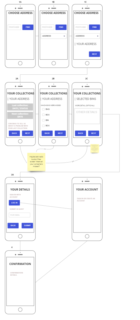
Mapping form flows
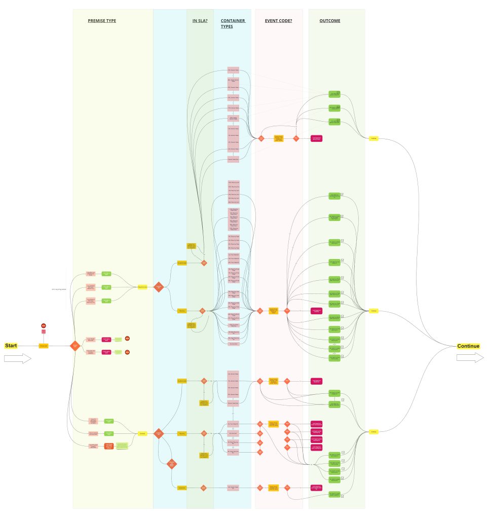
We mapped all the user flow variations with updated service information recorded by the crews for missing a collection. We’ve used this to cover all possibilities and review the friendly titles and error messages. This will allow the collection status information to give users a clear explanation and next step and remove dead ends.
Evolving archetypes
We’ve used the data to start evolving some simple archetype and persona cards, which we can match to problem statements and user stories.

What we’ll do next
Provide collection status
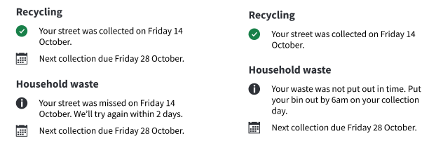
We will scope adding the status of recent and due collections, particularly if we already know we’ve missed an area and will come back.
Our evidence suggests we should display this at the start of the flow, instead of as validation error messages which make the user think they’ve inputted something wrong. This text should display a friendly message if any reason codes are recorded against the users’ containers, such as they were not presented or were contaminated, or if we have recorded that their street was missed, for example due to roadworks. This allows the user to see information that is personalised and can avoid wasting time filling in the form if they don’t need to.
This also allows us to show recent and next collection dates, simplifying the UX for the related tasks of checking dates and reporting problems. It saves users time if they are unable to make a report, so they don’t have to visit a separate app or get a dead end.
We will consider including non-standard collections such as bulky waste or garden sacks in future and including a link in confirmation emails to see a simple report status, so users know if or when to take a next step.
Allow multiple containers
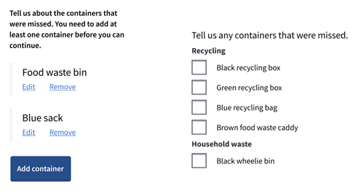
Our research found that being restricted to reporting a single bin, box or bag is a significant paint point. New designs need to allow the user to tell us if multiple containers were missed.
We tested a pattern where users can add, edit and remove containers, including their location. All the users we spoke to told us a checkbox list pattern was much simpler, with fewer clicks meaning less interaction cost. They said they do not need individual location options.
In an ideal world, the user only needs to tell us if their recycling, waste, or both were missed. The service only needs to know if the recycling or waste truck should return.
However, crews record containers individually. For example, we may record that a cardboard container was contaminated so the user is only eligible to report the others.
Therefore, the user should be presented with a checkbox list of containers that are eligible for reporting. Any that are ineligible should be explained in the collection status information above.
Alternatively, to reduce the volume of reports sent to the business for the same address, we may consider refining the status message to say if either some or all of the recycling was missed and why, then present a general checkbox for recycling only if at least one container is eligible.
Make account sign in optional
We get a lot of feedback and complaints about signing in. Currently there is little benefit to the user of doing this, as their address is not pre-populated, and they cannot see friendly status information.
Moving the sign in to the submission end of the form instead of interrupting the flow before starting will reduce friction.
The sign in should be optional with an option to submit as a guest and any benefits of signing in made clear, such as the ability to see your previous reports. This can be updated in future iterations if and when more benefits are realised from a single sign on across council services.
Remove the date and time picker
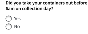
The calendar and time controls are not accessible or user friendly and it causes frustration to ask what day and time the bins were put out. Users don’t understand why we’re asking and don’t always know the answer. We should remove these inputs and consider why we need to know. What do we do with the data?
We should tell users in the lead in page content that their bins may not be collected if they are not put out in time and record containers not presented, so the collection status can tell the user why they were missed. We can remind users in the confirmation screen and emails.
If this data is essential, then we should replace it with a yes/no radio button to reduce frustration. However, our research shows we cannot expect answers to always be accurate.
Remove the location dropdown
Users told us they usually put their containers together in the same place. We tell them in the lead in content they must put their containers on, or close to, the kerb outside their property, or in a bin store for blocks of flats. We don’t need to ask where they put them, as most options are limited. We can remind users in the confirmation screen and emails.
We should include a free text box to add more detail if they have an uncommon situation. We should make this field mandatory for users who have an assisted collection, as there is more variation in the possible locations.
Considerations
We want to explore further:
- what the service pathway might be for escalations, without having to call or make a formal complaint
- what we could do with ‘late’ reports, as there is value in not blocking the form outside the SLA, but we don’t want to overload the service with reports that can’t be actioned
- combining this with other waste services to simplify the UX and reduce other known pain points, such as ordering new bins
- how changes or introduction of any charges integrate with the flow, such as fees for replacement bins
Thinking about a wider product
We’ve:
- designed wireframes for the common flows
- made high level, low fidelity sketches to demonstrate how the product could be iterated to include other waste services
- included features for the backlog which need further validation, but we hypothesise could allow more users to self-serve online
We know we also get lots of negative feedback about the current collection day finder (CDF) and a lot of calls related to ordering new containers. This suggests further scope for improving these services.
We hypothesise that an ‘all-waste’ product could include the three task groups of:
- collections (check and report)
- containers (order or return)
- bookings (book, change or cancel non-standard collections)
Including the recent and next due collection dates in the status information removes the need for a separate CDF, if we include a link to download your annual calendar. This would satisfy the first task group.
We could do further discovery to add the other two task groups in future iterations which will require integration with booking and payment systems.
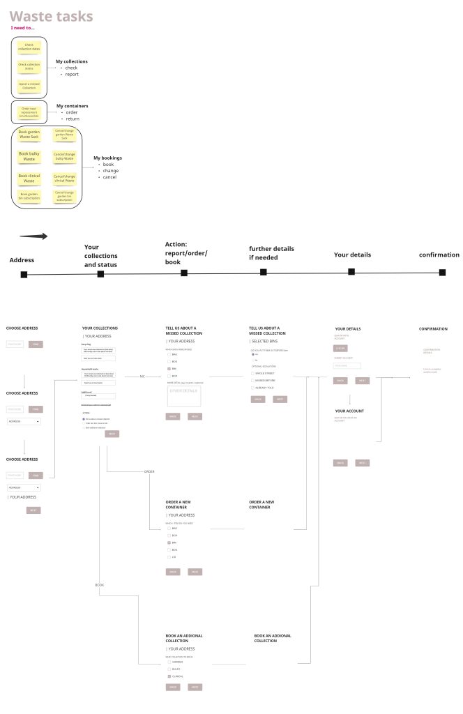
We’re discussing with the service and developers these findings, integration possibilities and limitations with the back-office system, and a questions protocol to streamline and justify the data we ask for. With this research and clearly defined problem statements, we plan to collaborate in a condensed design sprint workshop.
Sign up if you want to take part in research to improve our digital services.