
A question that comes up periodically is whether to design separate journeys and touchpoints for different user groups, such as individual content pages and forms for different audiences, or to focus on a topic or service and the common needs of their users.
We decided to do a mini discovery into these approaches to consider what’s best for our users.
As-is
Much of our website is split into sections for separate groups or segmentations of users.
We then split content according to the audience. If a service is relevant to multiple audiences, we may have separate pages for them and separate interactions such as referral forms. This is intended to allow us to categorise users and write user centred content according to our understanding of their different needs. This helps us to organise information in a systematic way.
Problems
Some of the potential drawbacks with this approach include:
- the needs of the different user groups are often not that different, particularly when thinking about the end goal of an interaction, such as ‘I need to make a referral’, or ‘I need to report something’
- it separates people rather than looking for common goals and can become less simple
- users sometimes fit into more than one category, or will seek the outcome they expect another category will give them
- having multiple pages about similar things is more difficult to maintain, and has more risk of disparate user experiences and content becoming outdated or inconsistent
- users using a search engine may be presented with several results that look similar, or arrive at one not intended for them
- there is a higher cognitive load for users who must read content to understand whether it’s intended for them
- we require users to have an existing mental model to understand there are different segmentations to navigate out of the wrong place
- users don’t always define themselves in the same way we do, for example some parent carers of disabled children define themselves as professionals but we mean people employed to provide support
- audience based segmentation is more typical in marketing environments that may want to appeal to the users’ sense of identity, using comprehensive data about them
This scenario can be visualised with user centred design thinking from wayfinding practice, which typically focuses on how people navigate through complex environments such as an airport. We can imagine our website as a large civic hall, with hundreds of officers representing different gateways for people into a particular service. If we break those down into more fragmented funnels for different audiences within each service, it becomes increasingly chaotic. As we know from navigating airports, more signs and content explaining who’s supposed to do what and where often ends up with more confusion. If you join one queue for a service, only to later find we actually require you to join a different queue for another variant of that service, it is easy to become frustrated.
Feedback
We know from general user research and feedback about our website that users often tell us there is too much information and too many pages and forms to easily find what they need.
Some services report problems with users completing the wrong forms, either because they didn’t read, understand, or rejected our categorisation of them. Even though it seems clear to us what we want users to do, and we’ve explained it, they are not always behaving in this way. This causes delay for users and extra work for us.
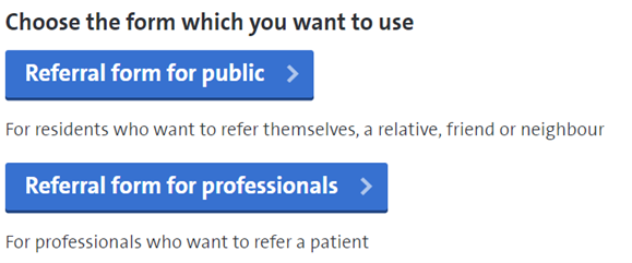
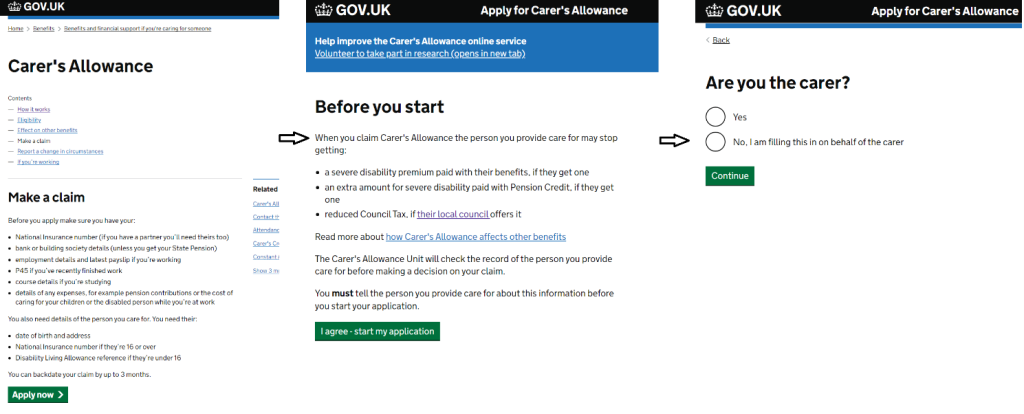
For example, teams handling carer’s assessment referrals accept referrals from two groups of professionals, and service users themselves. They ask similar questions for each, asking some for extra detail. This is handled by different pages and forms for each group. However, they have told us that users fill in the wrong forms, and find their content split into separate places more easily becomes outdated and difficult to manage. We had similar feedback about occupational therapy referrals.
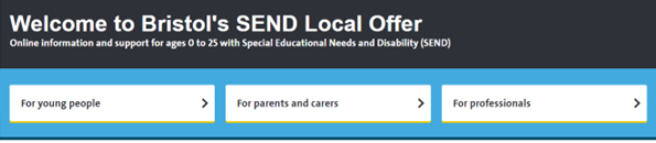
We also considered this question when looking at how to launch a new digital offer for Family Hubs. The information for parents and carers problem space already includes a Family Information Service, SEND Local Offer, Early Years hub, adult wellbeing directory and Care Leaver’s Local Offer, in addition to over 100 pages on our website. Most of this is targeted at specific, but overlapping, audience segments that usually reflect the structure of the commissioning team or service more than the common user needs. We did some user research with a questionnaire and in-depth interviews with parents. They told us the existing information is hard to navigate, difficult to find and overwhelming. They said they didn’t know where to look, there was too much information and “you need to read more and more to find out if there is something that is useful or if it is actually for you”.
Options
There are three main ways to approach this problem. In these generic examples, there is a user need to apply for a service and three user groups or type of referrals the service takes.
A) three pages, three forms
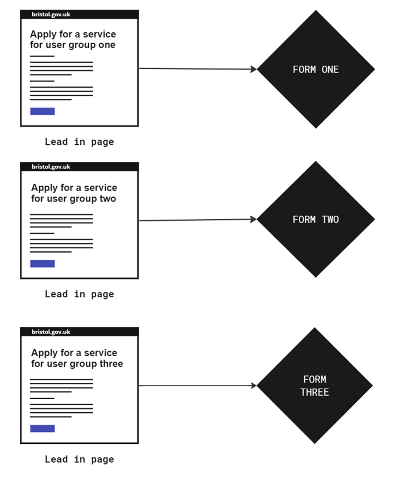
In this example, there are separate content pages and forms for the three audiences. This is how some of our website is currently organised. It allows for us to organise things into the categories we define and aim specific content at different people. However, it is not very user centred to define the user experience based on our organisational categorisation. It results in six artefacts (pages and forms) which is more to maintain, has risk of overlap, and with multiple entry points has more risk of users being in the wrong place.
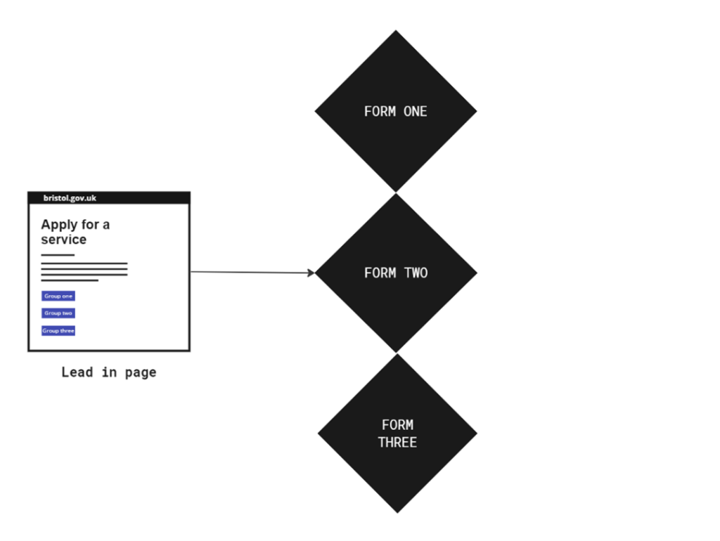
B) one page, one form, three flows
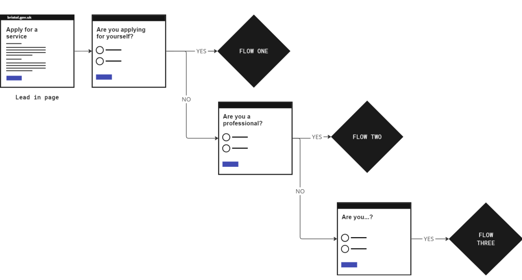
This could be the simplest option with two artefacts: one page, and one form. This is less to maintain and offers a more streamlined experience. The three user groups have a different flow of questions based on yes/no questions handled by branching. This approach prefers to look for what users have in common, rather than separating them by our definitions, then personalising the flow following a series of inputs. It means users can more quickly progress to the interaction stage of their journey. The risk could be that if the form flow is not defined well, there could be more questions, and if it becomes a complex form with lots of conditional logic it may be affected by the performance of the form platform. This can be mitigated by the one thing per screen pattern, using robust software and testing.
C) One page, three forms
A hybrid approach might be to use one landing page, and three forms with three calls to action. This is used in some parts of our website.
This may be better that the first option, as with a common starting point there is less risk of users finding the wrong place. However, there are still four artefacts to manage, users may still select the wrong CTA button or reject our categorisation, and it relies on having multiple calls to action on one page. Government design standards state that having more than one main call to action (CTA) reduces their impact and this requires more effort from the user.
User research
Behaviour on the web
We know that generally on the web, most users scan rather than read content to quickly find what they’re looking for. In our example of making a referral, this is usually the CTA button to start the process of giving us information. There is a risk the user does not fully read the content to check if it’s intended for them.
Similarly, most search users go for the first or second result and may not fully browse to check if there is a different place intended for them. In this way, users often go for the first thing that seems to match what they’re looking for and only quickly check, before submitting to the desire to just press the button.
Analytics
In a sample of 10 pages from our website which feature content explaining a service and who it’s intended for, followed by a CTA button, users spent an average of 44 seconds before moving on. This included the occupational therapy referral form, which has the form CTA placed at the end of a six step guide. This seems to support the idea that our users are not spending much time reading and understanding how we’ve segmented them before continuing their journey.
Workshops
In 2021 we tested a mock-up of a redesign of the SEND Local Offer website which replaced the segmentation approach, such as parents or professionals, with topic based sections, such as education or health. This aimed to test the hypothesis that simplifying the content could reduce bloat, make it easier for users to find what they’re looking for and be in line with a strategic aim of bringing together the different user groups using a single source of truth.
We did a series of workshops with 42 participants, including the main user groups of stakeholders, parents and professionals and asked them to review the current and mock-up versions.
Feedback about the as-is included:
- “the same information overlaps too much”
- “you have to go through a lot of pages until you get where you want to be”
- “there’s so much content! Can make it difficult to find what you need. Some of the content feels buried – you have to click a lot to get to a specific page”
- “separation for parents/professionals/young people doesn’t make sense”
- “parent/carers, professionals, young people sometimes need the same thing, and you can find it under one tab but not the other”
- “why is there 3 different info? There’s fab resources for MH in young people but it’s not there in the parents’ health tab”
- “not sure the way you have organised the information is the best for parent carers. It looks like you have done what works best for professionals and services, not parents or young people. Where would I find information on housing, benefits, transport etc. for example?”
96% of users preferred the task and topic based mock-up. Only one person preferred the as-is.
80% said the topic based design was easier to use. Three people didn’t, and three didn’t know.
54% of stakeholders said they prefer information organised by topic and 38% wanted a combination of topic based and targeted content, such as a ‘portal’ for forms used regularly by certain professionals.
Competitive analysis
GOV.UK
We did a brief review of other council and central government websites. Notably, GOV.UK is organised with top tasks first and then into topics.
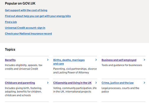
Gov.uk has more than half a million pages and digital services for various categories of users, including citizens, businesses, and professionals. It’s recently been updated, following the idea that the simplest approach is to organise things by a common need based on the task users are trying to complete. This also helps to make sure that everyone is working from the same information.
When services need different sets of information from different user groups, it is handled by branching within the form. This means the user can progress more quickly into the interaction they are looking for and can answer the questions instead of needing to read lots of content and comprehend the organisational structuring. This requires less interaction cost and is more accessible as the user is focused on one thing at a time.
Most other public sector websites we looked at followed a similar approach, focused on common user needs instead of separating users by our definition of their identity, and handling different flows with branching and interaction, although there was some variation.
Peer thinking
We asked an online community for digital designers in local government for their thoughts. Four out of five replies suggested they would generally go for topic based design, using examples where data had shown users didn’t always follow categorisation:
- “I’ve always been biased towards task / topic-based content and to let the users decide what’s relevant to them”
- “I’d tend to go for task based wherever possible”
- “I agree task/topic based”
- “I would look at starting in the same place /form and ask questions that branch out to other journeys”
It was highlighted that context is key, such as there are some exceptions for specialist topics, and considering the importance of the language we’re using.
Best practice guidelines
As industry leaders in UX research, the Nielsen Norman group advise against organising web content by audience categories. They have a short video explaining how this degrades usability. They recommend using a common topic or tasks based approach, and using some specific, audience targeted content only when there is a very distinct set of needs.
Design principles
The GOV.UK Design principles do not specifically advocate for task centred design. However, some of their principles are relevant to the question.
Design with data
“In most cases, we can learn from real world behaviour by looking at how existing services are used. Let data drive decision-making, not hunches or guesswork. Keep doing that after taking your service live, prototyping and testing with users then iterating in response.”
If we have evidence that users are not behaving how we intend them to, then we should be open to trying other approaches.
Do the hard work to make it simple
“Making something look simple is easy. Making something simple to use is much harder – especially when the underlying systems are complex – but that’s what we should be doing. Don’t take “It’s always been that way” for an answer. It’s usually more and harder work to make things simple, but it’s the right thing to do.”
Having a form that triages users may be slightly more effort for us to make, or not what we’re used to doing, but requires less work from users. A common landing page and form or product that is responsive to its users makes it simpler for them.
This is for everyone
“Making something look simple is easy. Making something simple to use is much harder – especially when the underlying systems are complex – but that’s what we should be doing. Don’t take “It’s always been that way” for an answer. It’s usually more and harder work to make things simple, but it’s the right thing to do.”
Having a form that triages users may be slightly more effort for us to make, or not what we’re used to doing, but requires less work from users. A common landing page and form or product that is responsive to its users makes it simpler for them.
Be consistent, not uniform
“This isn’t a straitjacket or a rule book. Every circumstance is different. When we find patterns that work we should share them, and talk about why we use them. But that shouldn’t stop us from improving or changing them in the future when we find better ways of doing things or the needs of users change.”
This suggests that we should be open to trying new things that work elsewhere and we don’t have to stick to how it’s always been done or do everything in a certain way.
Task-centred system design
Key approaches to task based system design include understanding the goals and needs of our users, identifying what the task is they’re trying to perform, designing for efficiency, and grounding interfaces in reality.
Considerations
There is no single right or wrong answer, and most design decisions are best made on a case by case basis, considering the evidence. A key principle is not to rely on our assumptions or current way of working, but to test options with users. We also need to be clear about the problem we’re trying to solve and understand what the blockers are and how to overcome them.
We could use heatmapping to understand further if users really are reading and taking the time to comprehend the targeting of our content or just going straight to an interaction.
We also need to consider organisational culture. How design and agile mature is the workplace? If the culture is more avoidant than innovative, such as organisations with high risk aversion or worries about workloads and resources, then we should consider what is the benchmark of evidence for a different approach? How to start small without redoing too much work already done? How to measure any impact?
It is also a false dichotomy to suggest a binary opposition between these two approaches. In reality we can use both in the right situations. We know that often there are common needs, and we could make things simpler and more consistent, especially when dealing with services with wider relevance. However, some targeted areas may benefit from segmentation, such as repeat professional users who need a quick way to access products that are only for them.